For the workshop week I could choose from five different workshops. This workshop appealed to me the most because I am interested in typography myself and would like to learn more from it. The workshop week was from the 8th of October until the 12th of October 2018. The workshop was given by Mathias Noordzij. Monday was the intro of the workshop but I was not there. The workshop only started for me on Tuesday. From fellow students I heard that on Monday there was a workshop in calligraphy and working with a grid.
Dinsdag 9 October
Tuesday the workshop started with a lecture about two designers: Jan Bons and Willem Sandberg. Both of their works are the reason for the first assignment. The choice of material is that they both work with paper. The first workshop assignment was to form letters with coloured paper by tearing them and without using scissors.
The next assignment is to double fold paper and cut a letter shape from it. This will make a kind of 'pop up' letter.
The next assignment was to make a letter/alphabet on checkered paper. The rule was that the boxes are only filled in completely. (no diagonals / round corners) It was also the intention to work on the grid of the checkered paper.
"A typographer is someone who arranges with existing letters.
-René Knip
Thursday 11 October
The workshop started with guest lessons from designer René Knip. The lecture he gave about his portfolio was very interesting. His work can be seen spatially but also on paper. In 2D & 3D. He made a lot of work which can also be seen in public space. He also made the nameplates at the Oostlijn in Amsterdam. Furthermore he explained that a typographer is someone who arranges with existing letters. He put a lot of emphasis on this because he sees in the field that not everyone knows what a typographer exactly does.
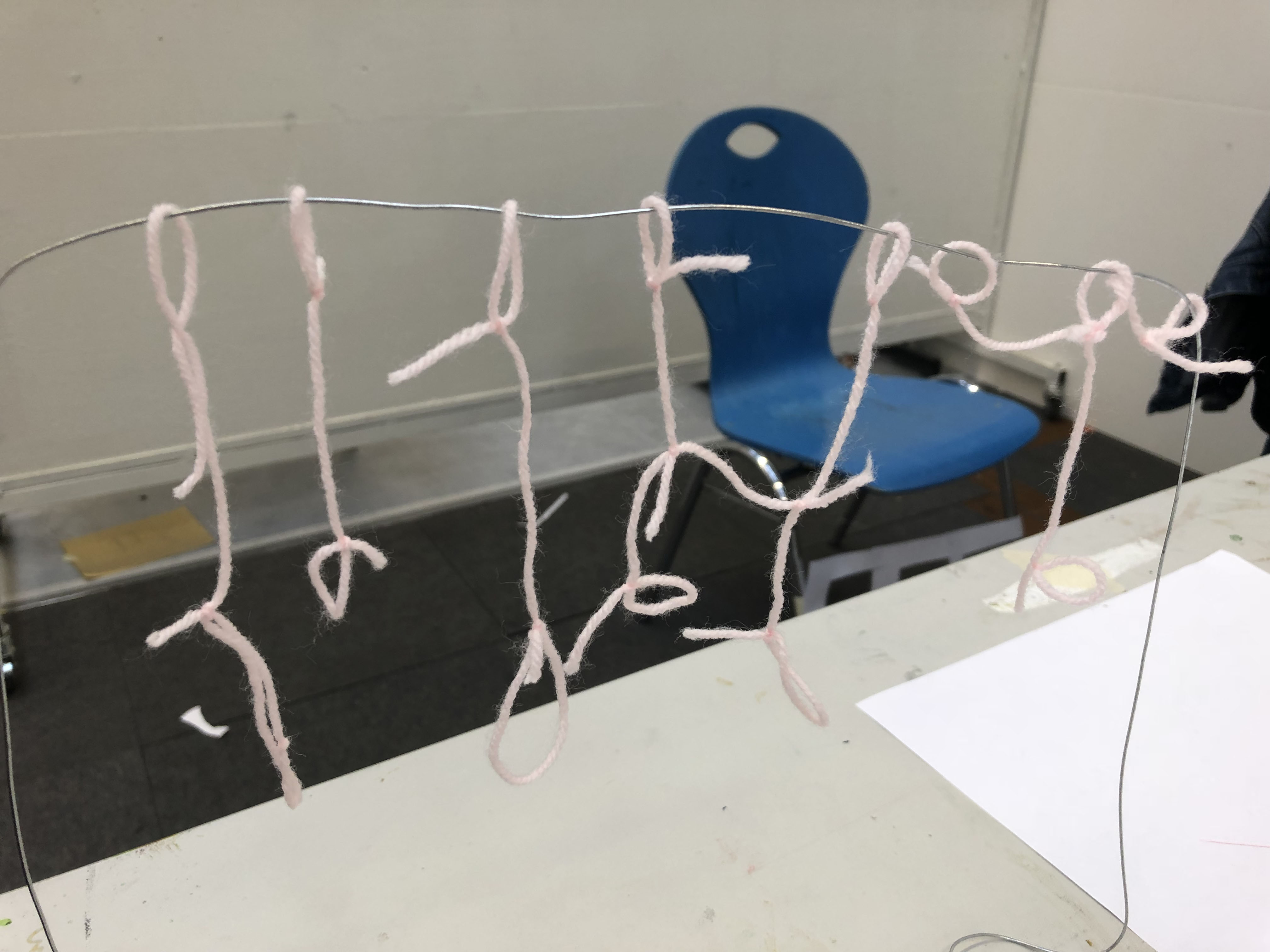
The assignment was to spell out a letter or word in the open space that can be viewed from several sides. The material I brought with me was pink wool and iron wire.
While pulling the rope the word 'Halloween' suddenly came up. I thought it would be fun to spell that word in the spider's web. But that didn't really work out either. After that I started looking at how to make the letter hang / float. Finally I spelled the word: 'Light'. I thought that worked out pretty well.
Friday 12 October
On the last day of the workshop it was the intention to choose one of the works of the past week and continue with it. I chose to continue with Tuesday's assignment about making your own font. At the end of the day we gathered everyone's work to see how the past week went.
Evaluation / reflection
The workshop week was very nice and interesting to follow. I absorbed a lot of the information and I will not forget René's guest class. Letters can be designed in a million different ways and ways. Working in a grid and adding or subtracting lines to it adds a lot of value to a newly designed letter. I also came across René's work in Amsterdam. I took some pictures of it.
Studium Generale 2018: De 10-koppige ontwerper Schmetz, I. (z.d.). Welcome to 310k, a Pure Magik Company. Graphic Design and Art Direction. Geraadpleegd op 4 oktober 2018, van http://www.310k.nl/ Depoorter, D. (z.d.). Dries Depoorter. Geraadpleegd op 4 oktober 2018, van https://driesdepoorter.be/ De 10-koppige ontwerper Voor de studium generale dit jaar mocht ik dit keer zelf de… Read more »